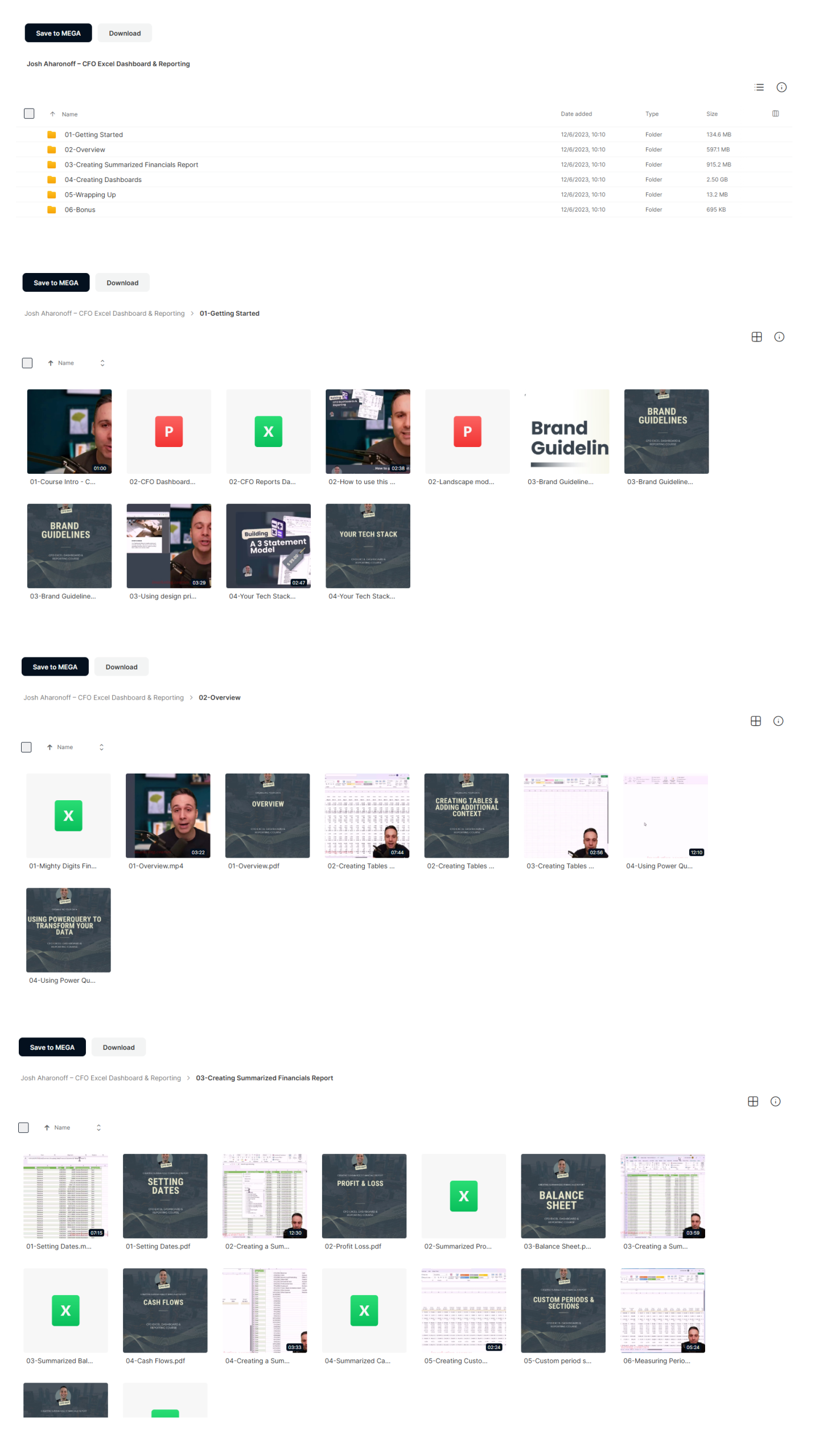
*** Proof of Product ***


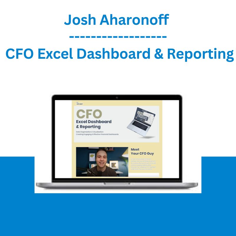
Exploring the Essential Features of “Josh Aharonoff – CFO Excel Dashboard & Reporting“
Excel Dashboard & Reporting
Data Organization & Visualization:
Creating Engaging & Effective Financial Dashboards
Karina G.
Really great, well-structured and very helpful course.It includes lots of practical tips and knowledge. I would recommend to anyone in the field of Finance and Accounting.
Jordan S.
Great excel course and love the output!
Dimos S.
Your course is fantastic, super easy to follow, keep killing it!
Meet Your CFO Guy
Hi! I am a fractional CFO for 40+ startups, and love all things Finance & Accounting. My favorite part of my job involves building sophisticated forecasts for companies to help them understand their business better
Are you ready to impress
with effective and informative financial dashboards?
Quickly understand what’s going on with the business
Compare changes to revenue and cost drivers over time
Never underestimate the importance of a visually compelling presentation
Create a concise structure for efficient reporting
Answer key questions on the most important KPIs
Tie it all together in Excel
The best CEOs I work with want quick insight into what matters most
This allows them to act fast in making vital decisions
Learning how to provide this data in a visually compelling way has been one of the biggest game-changers in my career.
Presenting the data is not enough – without proper design, important data points can get overlooked and messages can get confused or lost entirely.
By creating engaging and effective financial dashboards, you’ll add tremendous value to CEOs, the executive team, board of directors, and other key stakeholders.
Create dashboards your stakeholders need
Enhanced visualization
Efficient financial analysis
Key Performance Indicator (KPI) tracking
Real-time monitoring
Budget-to-actuals comparison
Customizable reports
Your Tech Stack
Use Excel to connect your financial model directly to the dashboards.
Organizing Data
Create tables, add additional context, and then use PowerQuery to transform the data
Create Financial Reports
Bring it all together – Profit & Loss, Balance Sheet, Cash Flows, and KPIs
Creating a KPI Dashboard
Organize your key metrics in a visually appealing way and compare it to prior periods dynamically
Create a Spotlight Dashboard
Showcase your most important metric on one slide with a design that will captivate your audience
Budget to Actuals Dashboard
Analyze your performance against your budget in the key areas of your business. Summarize your variances with powerful charts to showcase % hit or miss on each metric
Instructor
Josh Aharonoff
Founder & CEO of Mighty Digits
Hi! I am a fractional CFO for 40+ startups, and love all things Finance & Accounting. My favorite part of my job involves building sophisticated forecasts for companies to help them understand their business better, and I can’t wait to share this knowledge with you
Everyday I post Finance & Accounting tips on linkedin – if we haven’t connected yet, feel free to drop me a line to say hello!
Course curriculum
01
Intro & Getting Started
🎥 Course Intro
🎥 Your Tech Stack
02
Organizing Your Data
🎥 Overview
🎥 Creating Tables + Adding additional context – 1st video
🎥 Creating Tables + Adding additional context – 2nd video
🎥 Using PowerQuery to transform your data
03
Creating Summarized Financials Report
🎥 Setting Dates
🎥 Profit & Loss
🎥 Balance Sheet
🎥 Cash Flows
🎥 Custom periods & sections
04
Creating Dashboards
🎥 Getting Data Ready for Dashboards
🎥 Creating Date Selectors
🎥 Creating our first KPI
🎥 Finishing the KPI dashboard
🎥 Creating a KPI Dashboard with a graph
🎥 Creating a KPI Dashboard with a dynamic spill array linked to a chart
🎥 Budget vs Actuals pt I – designing our tables
🎥 Budget vs Actuals pt II – creating our Gauge charts
🎥 Budget vs Actuals pt III – finalizing our design
🎥 Management Report
🎥 Cash Out Dashboard
🎥 Creating a Cover Page in Excel
🎥 Creating dashboards using PivotTables
🎥 Creating Dashboards using PivotTables: PivotTable Profit & Loss
🎥 Creating Dashboards using Pivot Tables: Using Pivot Charts
🎥 Break Even Dashboard
🎥 Spotlight Dashboard Pt I – pulling in the data
🎥 Spotlight Dashboard Pt II – Designing the Dashboard
🎥 Closing Remarks
Please see the full list of alternative group-buy courses available here: https://lunacourse.com/shop/


